Apres Ski Festival
Publication Design
Edgar’s Mission
ciaranevindesign@gmail.com
0438 314 555
@ciaranevin.design
Brand &
Identity Design
Epilepsy Foundation
Rebrand
The Epilepsy Foundation is a non-for-profit, dedicated to fostering understanding, reducing stigma, and improving support and research so that no one living with epilepsy has to face it alone. Their most common fundraising method is through their self-titled op shop chain (Epilepsy Foundation, 2025).
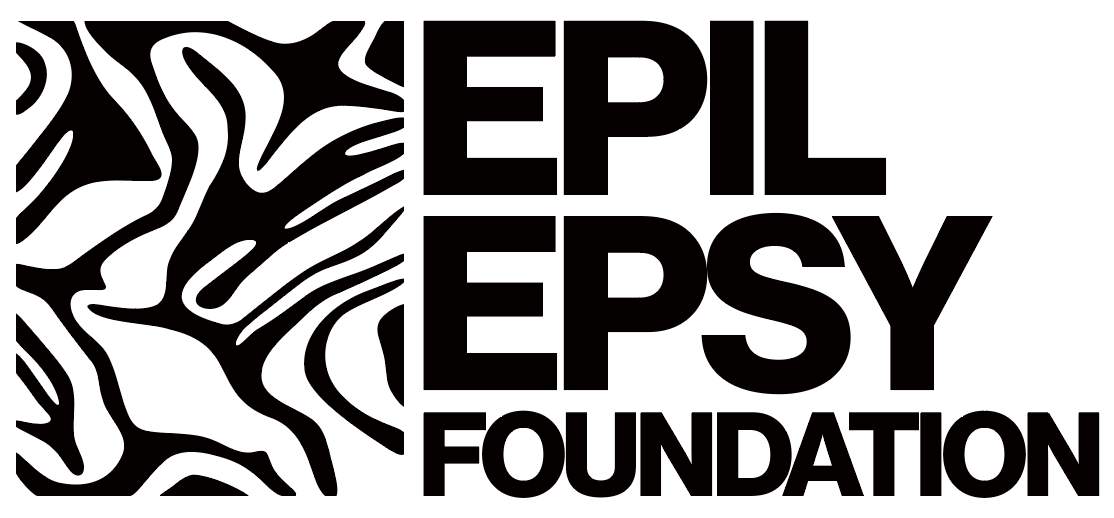
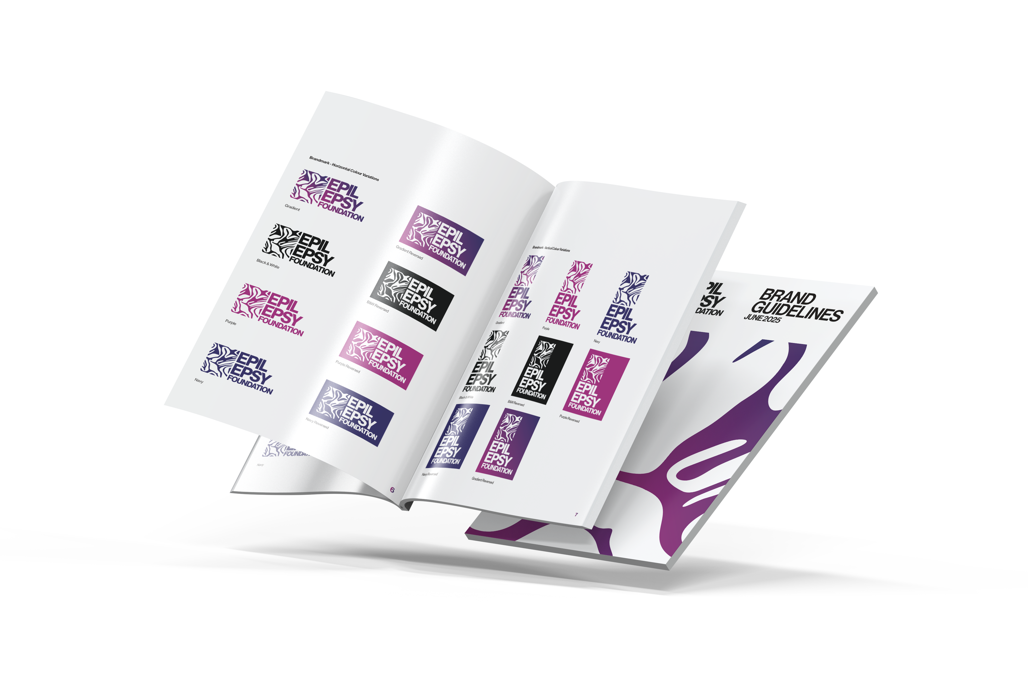
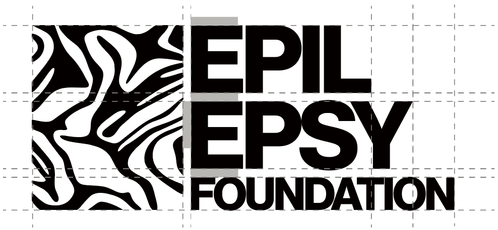
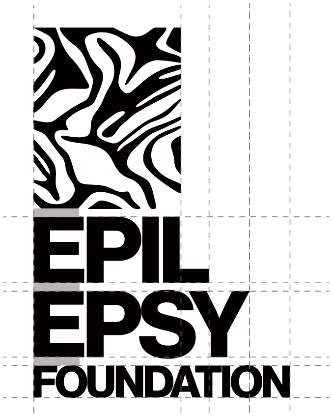
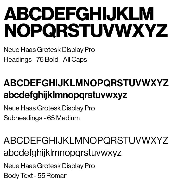
The rebrand was developed to engage the growing number of young people supporting slow and second-hand fashion, as the brand has received an influx of support from young people. The figuremark was designed with brain imagery in mind, while maintaining a youthful and energetic appearance. It began with a scan of purple cabbage (its creases resembling the folds of the brain) chosen not only for its form but also because purple is the globally recognised colour representing epilepsy. The image was simplified to create a bold and effective design. This project was supported by a full set of brand guidelines, including colour and type restrictions and layout variations of the brandmark.
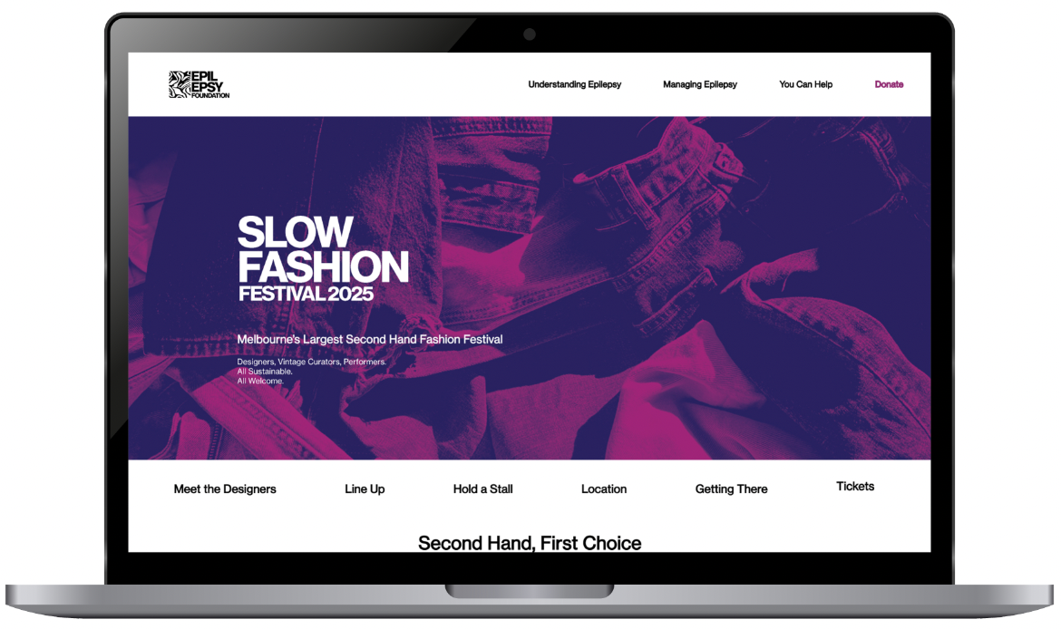
To celebrate their new branding, the op-shop chain is hosting a “Slow Fashion Festival” to promote circular fashion, celebrate small designers, and overall raise awareness of the Epilepsy Foundation’s charitable work.
*This project is in no affiliation with Epilepsy Foundation, as was completed for educational purposes only.
Brand Guidelines
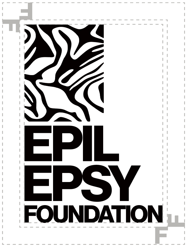
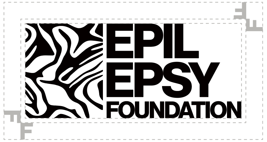
Spacing
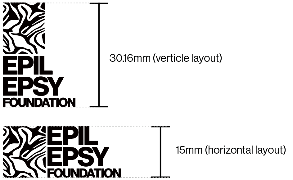
Minimum Space
Minimum Height
Typography

Purple
CMYK: 30 | 100 | 2 | 2
RGB: 160 | 35 | 119
HEX: #A02377
Navy
CMYK: 97 | 100 | 0 | 30
RGB: 37 | 14 | 98
HEX: #250E62
Accent Yellow
CMYK: 5 | 1 | 53 | 0
RGB: 248 | 242 | 145
HEX: #f8f291
Purple to Navy
45 degree angle



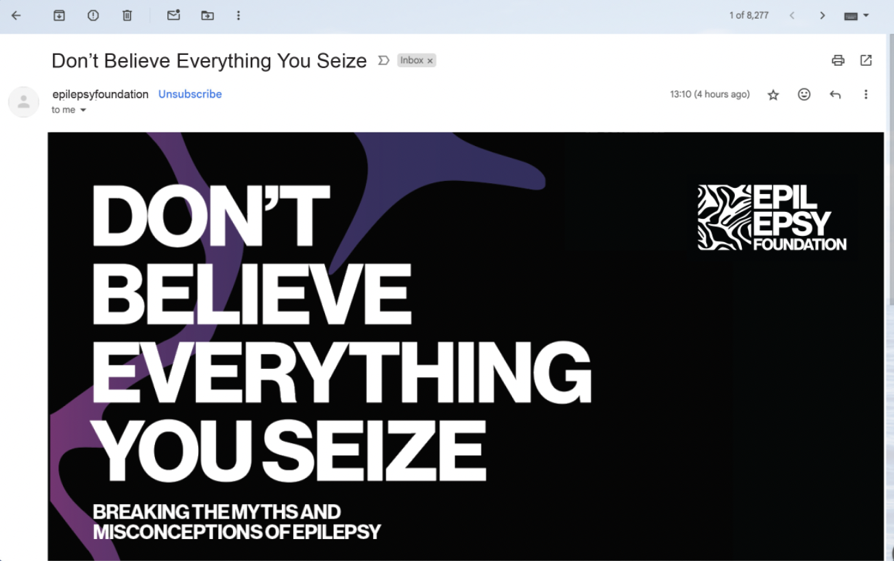
Email Direct Marketing
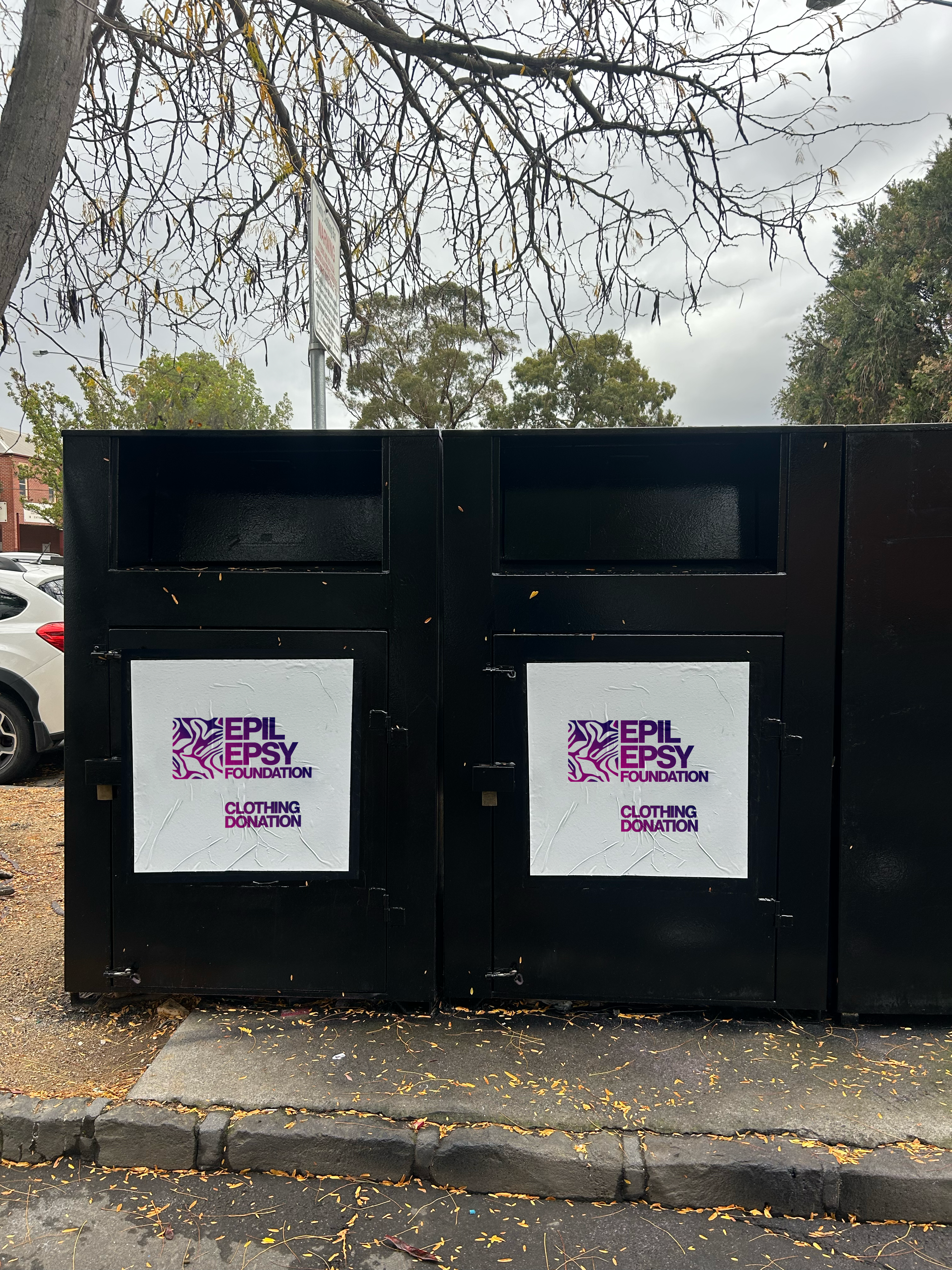
Clothing Donation Bin
Website
Instagram Reels
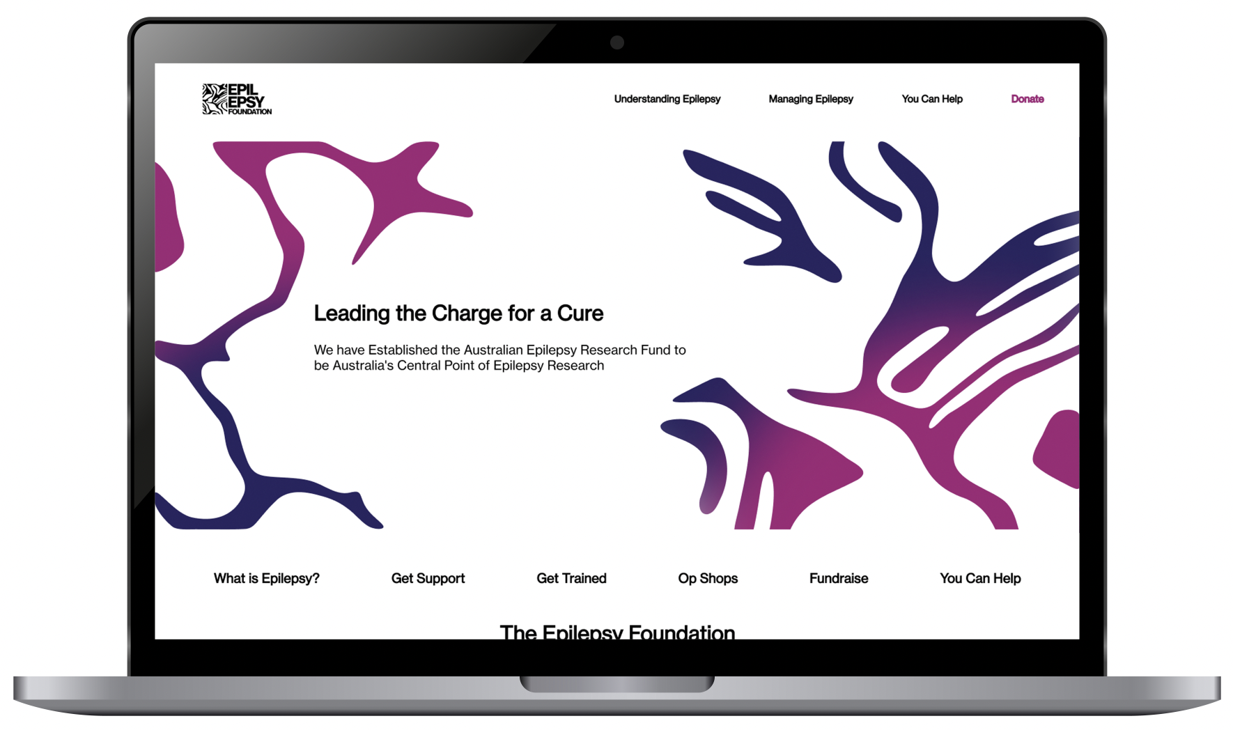
Website Landing Page
Event Marketing


ciaranevdesign@gmail.com
0438 314 555
@ciaranevdesign_

Primary Colours
Secondary Colour
Typography
Gradient
Pattern
Dual Tone Image Treatment
Collaborative Marketing Strategy
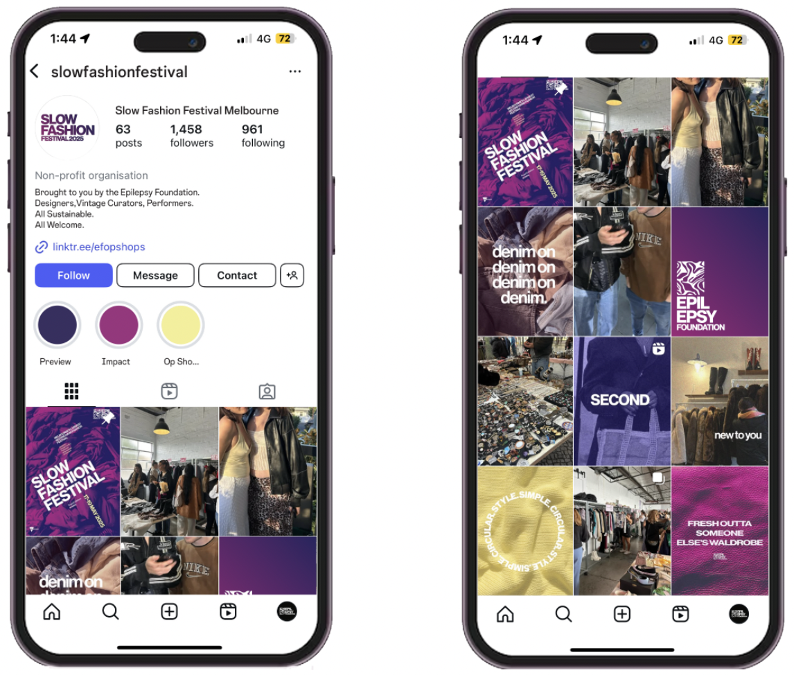
Social Media (click tiles to zoom in)
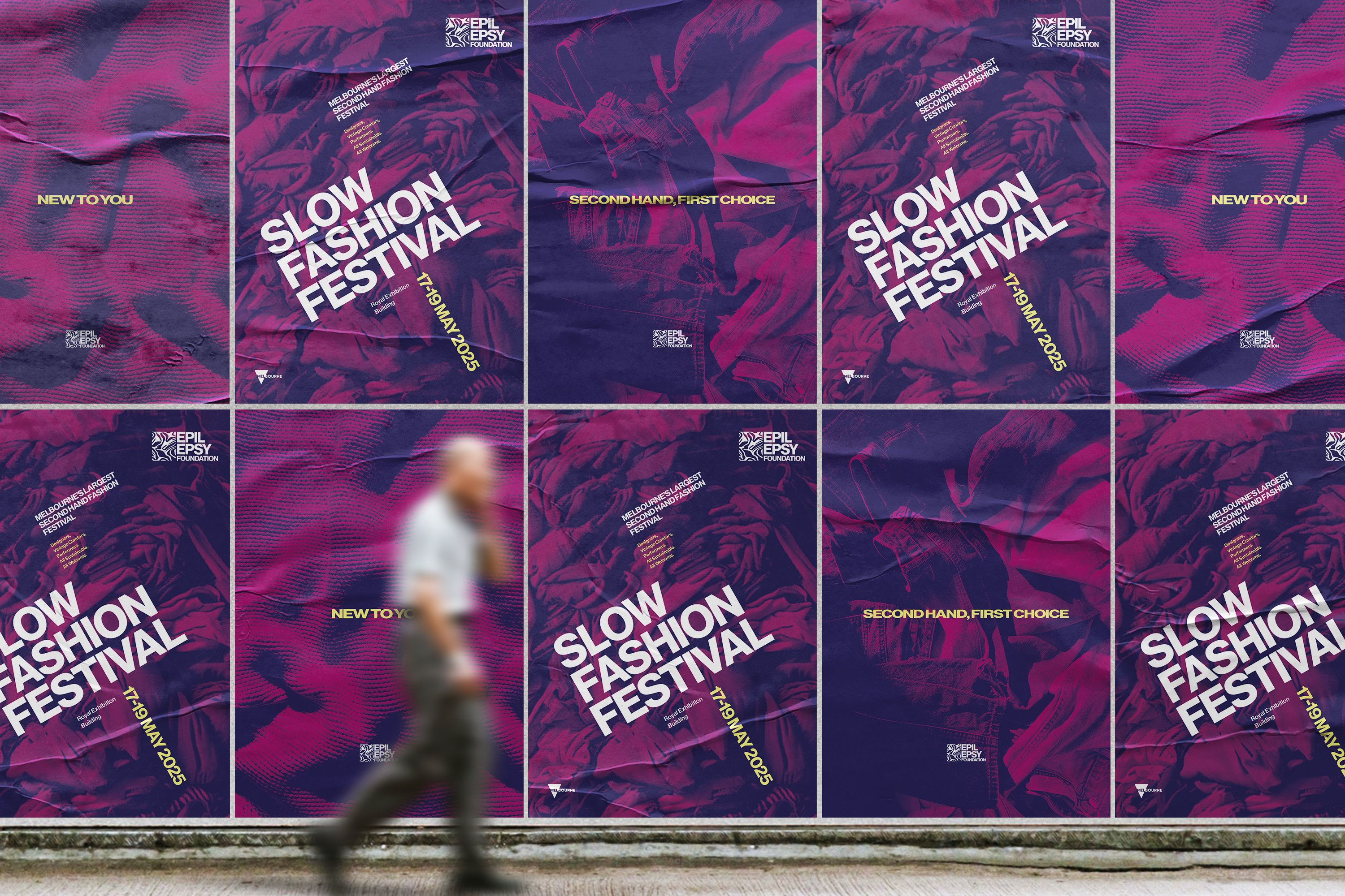
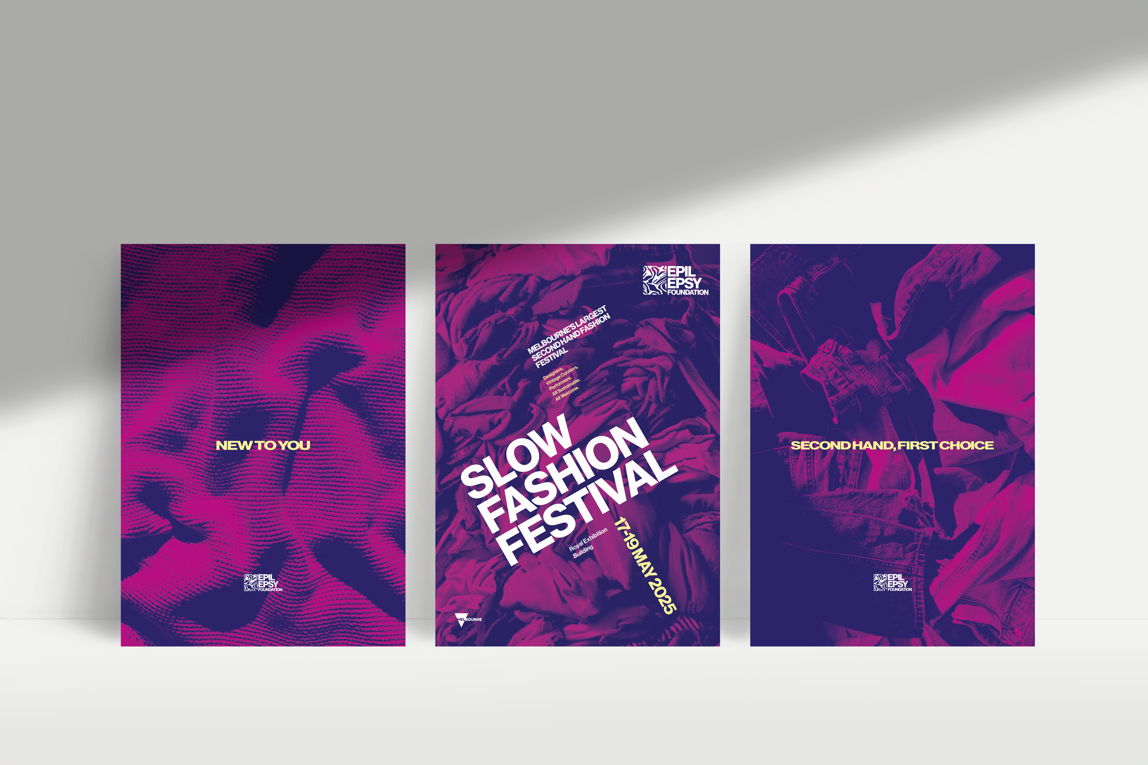
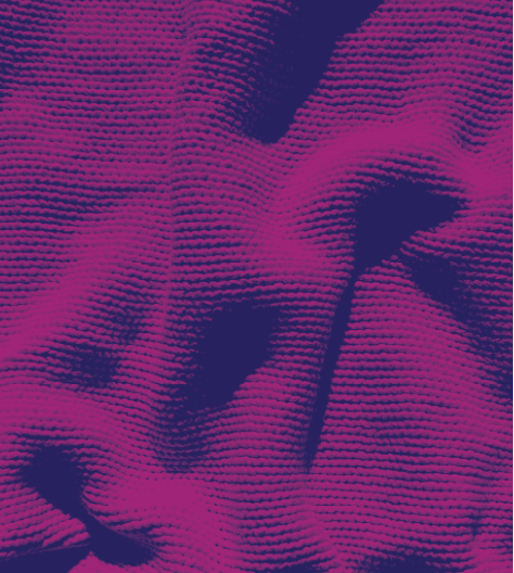
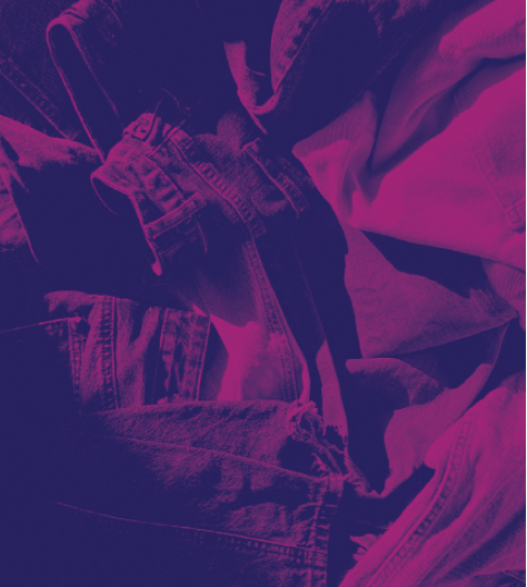
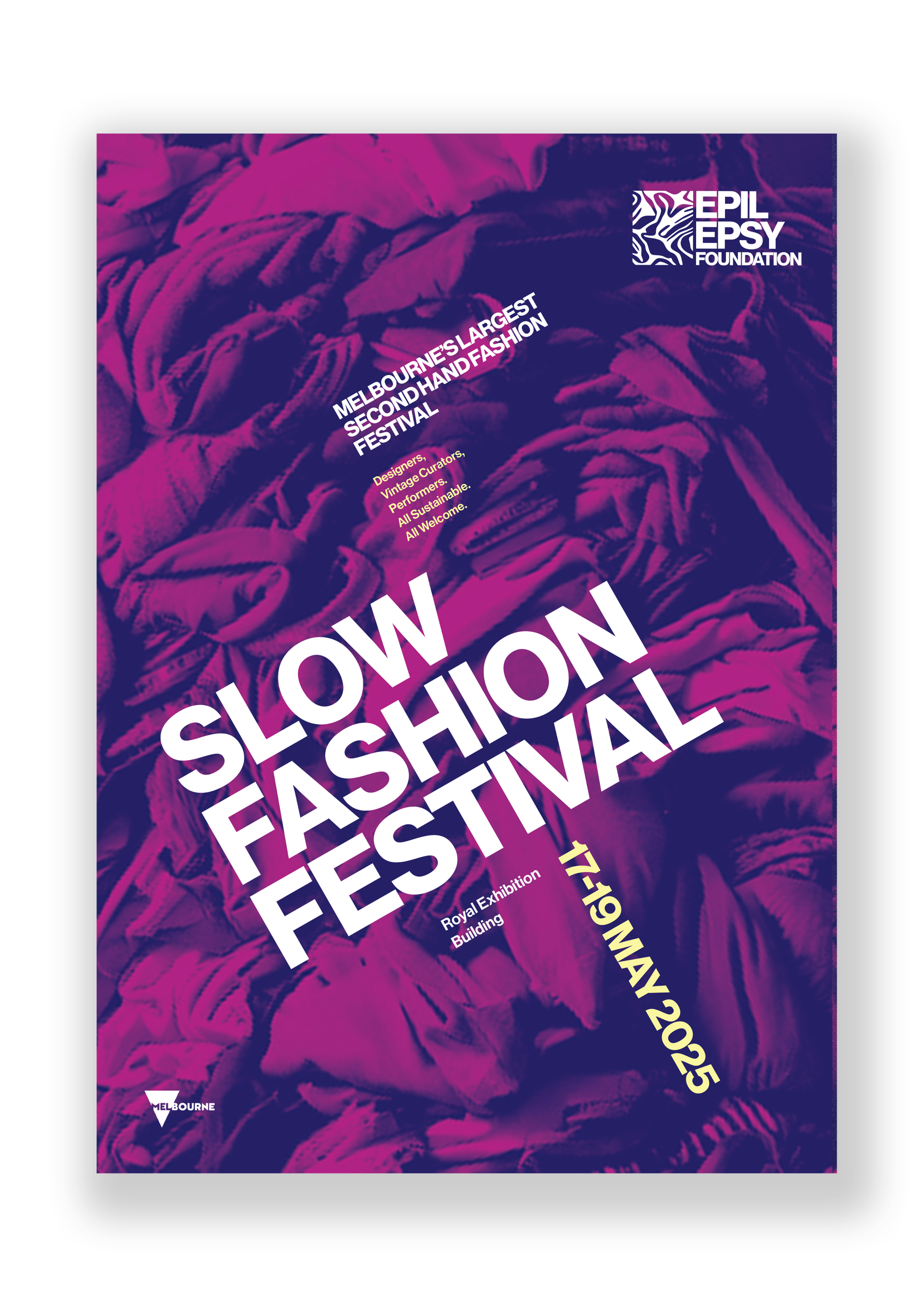
The background of the poster is a two-toned image of a pile of clothing. The folds and creases of the material connect to that imagery of a brain, and link to the fashion element of the epilepsy brand. The poster follows the branding guideline specifics such as colour and type. Text is angled, forcing the viewer to read it somewhat slower, relating to the name of the festival. Hierarchy is defined through size but also colour, as the introduction of the secondary, yellow accent colour provides contrast and highlights importance.
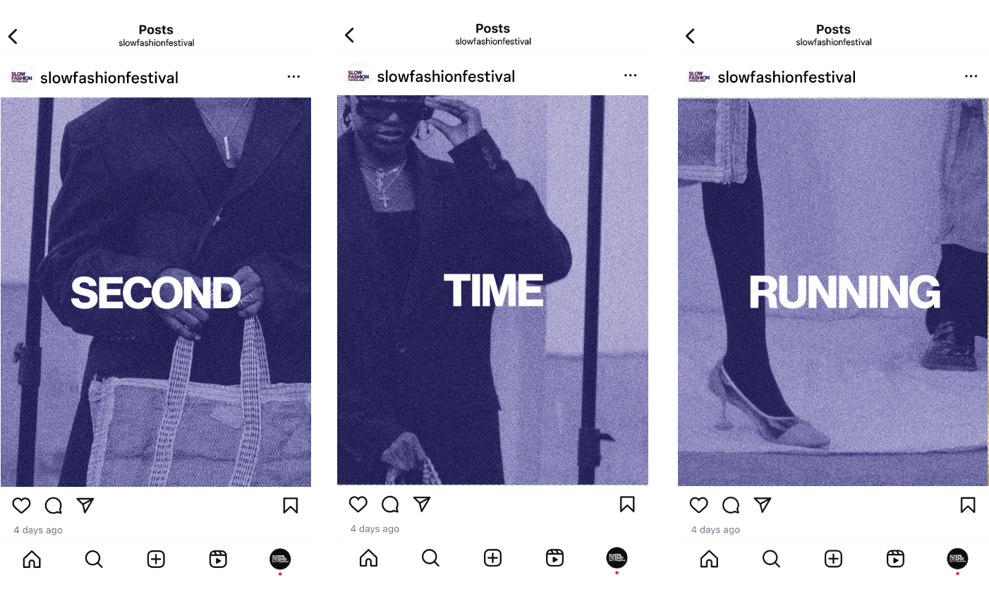
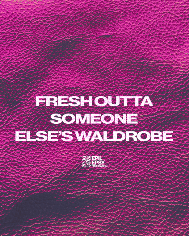
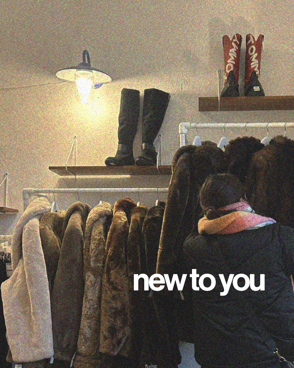
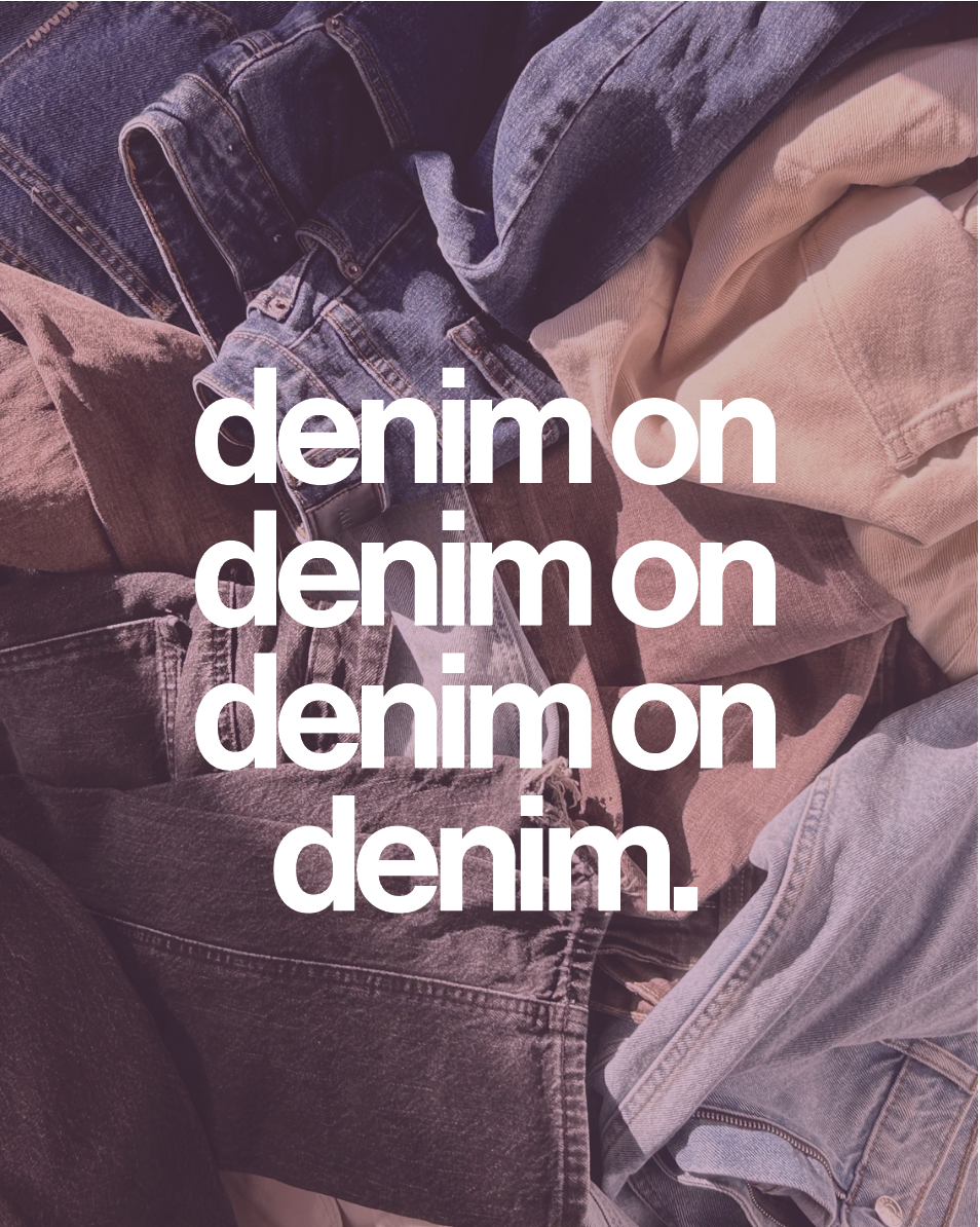
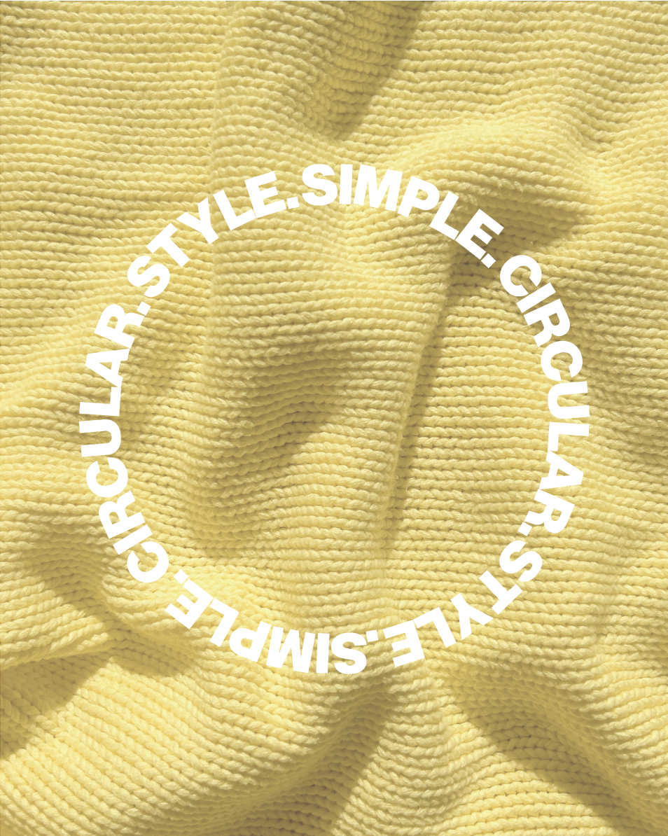
The supporting posters compliment the main poster well. The simplified variations connect to the festival’s branding through similar textured imagery, with a focus on catchy, youthful terms as taglines of the festival. Situated beside each-other creates a harmonious balance of typographic design, and supports the epilepsy brand guidelines.
Print Media
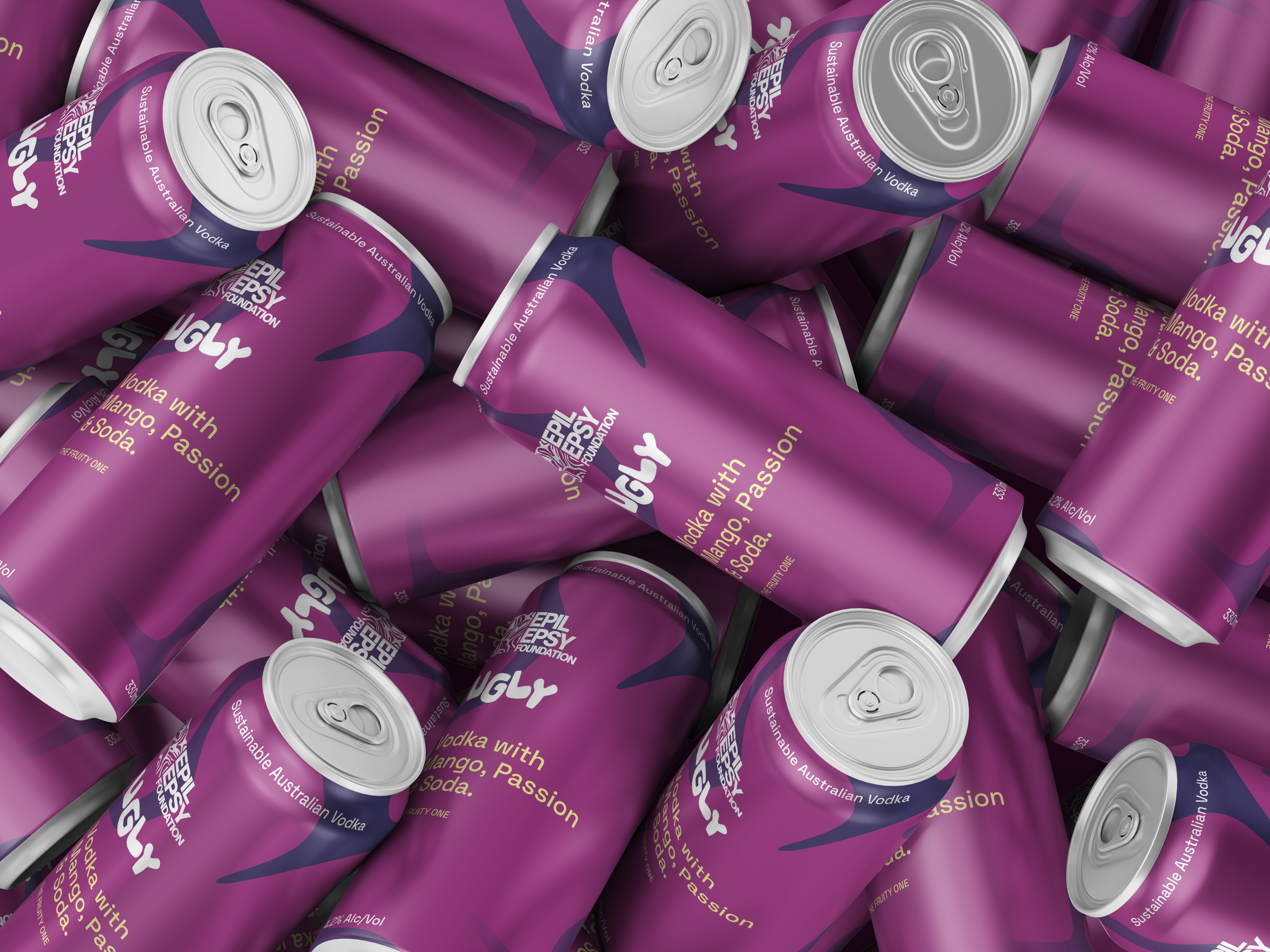
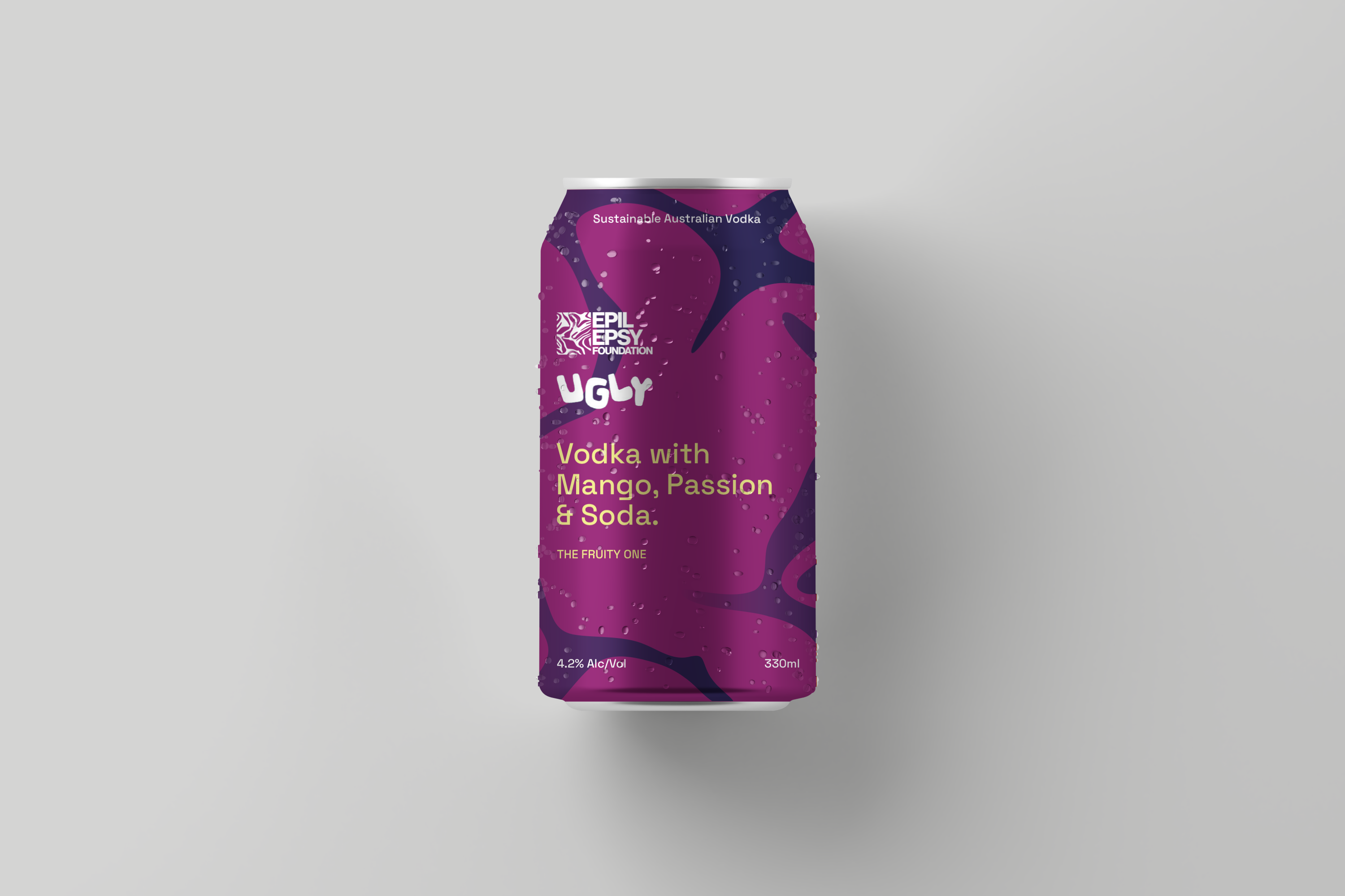
Ugly is an Australian start-up that produces vodka using apples rejected by supermarkets due to their imperfect appearance, with a strong focus on sustainability and reducing waste. These values align closely with those of the Epilepsy Foundation, whose op shops cater to a sustainability-conscious consumer base. Recognising their shared ethos and target audience, the two brands have collaborated to create a co-branded product: the ‘Ugly X Epilepsy Foundation’ vodka.
The design combines Ugly’s signature typography and layout with the Epilepsy Foundation’s distinctive gradient and graphic elements, while both logos appear at equal size to reflect their equal partnership. This limited-edition vodka will be the primary drink offered at the event, serving as a key promotional element that highlights their shared values and strengthens both brands through a collaborative marketing strategy.

State Library Annual Report/Monothematic Publication
Apres Ski Festival
Edgars Mission Farm Animal Rescue
Typography
Branding
Publication